Background
CEDP (Commercial Enhanced Data Program) is a VISA compliance requirement
that collects additional data on a transaction. When a transaction qualifies,
VISA provides improved interchange rates. This saves merchants and the company
money on every qualifying sale.
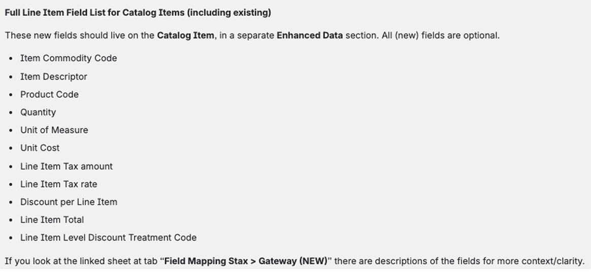
The PM identified the new fields we needed to capture, and they had to live
at two levels: the catalog (item) level and the payment link (transaction) level.
Challenge
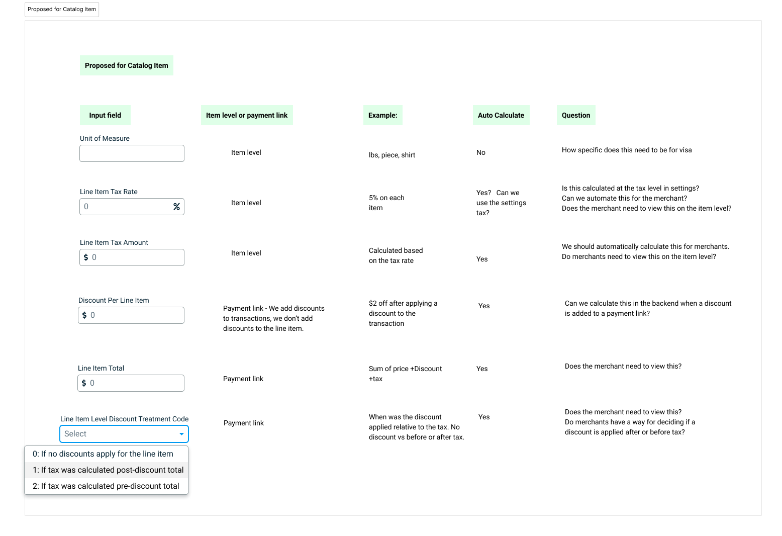
The initial instinct was to add the new input fields at the bottom of each page so merchants could see exactly which fields were required for CEDP. But after digging in, we realized most of those fields could be calculated automatically from data we already had, removing much of the burden from the merchant.
If even one field is missing, the transaction willl not qualify for the lower interchange rate. Instead of relying on merchants to fill everything in correctly, we decided to handle as much as possible on the backend and only ask for what we truly couldn't calculate ourselves.
Process
Deciding Where Each Field Lives
We reviewed every CEDP requirement and sorted each field into one of three buckets: catalog level, payment link level, or automated on the backend. This mapping exercise determined the scope of UI changes needed on each surface.
Fixing the Catalog Flow
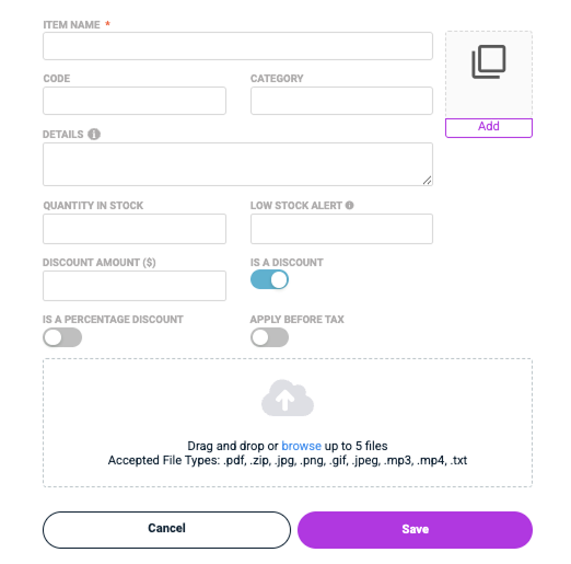
Once we knew what needed to change, we also saw an opportunity to address long-standing UX debt. The catalog modal was built over 10 years ago and had been patched rather than redesigned. The core problem: a series of toggles at the bottom of the modal determined whether an item was a product, service, or discount.
Turning a toggle on changed the form layout — hiding and revealing fields after merchants had already filled them out. Some toggles had labels like "allow discounts" or "is a percentage discount" with no explanation of what enabling them actually did. Adding a thumbnail image took extra clicks and used an outdated UI that didn't match our current design system.
Solution
Radio Buttons at the Top
Since a catalog item can only ever be a product, service, or discount, we replaced the confusing toggle system with radio buttons at the very top of the modal. Merchants make the decision first, and the form adapts to show only the fields relevant to that type. No more hidden fields revealing themselves mid-flow.
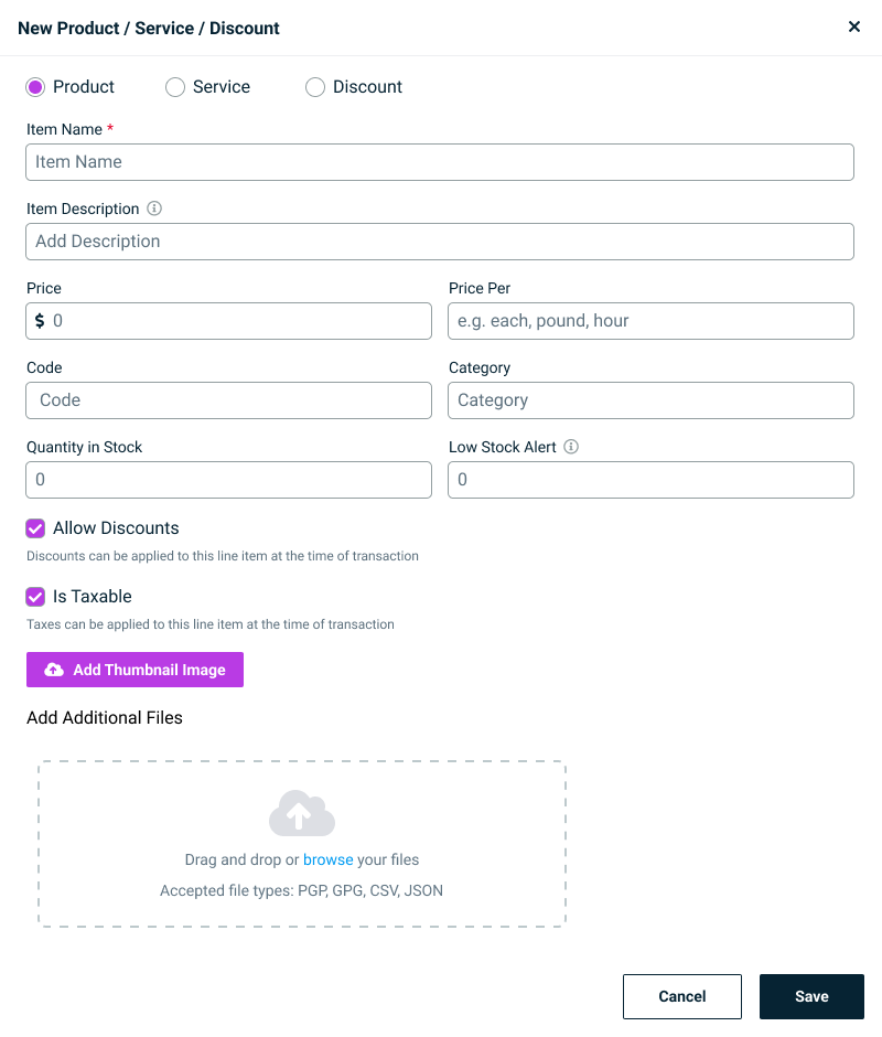
Minimizing the CEDP Ask
After determining which CEDP fields could be automated, the only additional input we needed from merchants on the catalog page was a unit of measure. We renamed it to "Price Per" to make it immediately clear. How is this item measured and priced per unit? Placeholder text with examples was added to remove any guesswork.
Outcome
Every screen touched during this project was brought in line with the latest design system. Merchants now select their catalog item type intentionally at the start of the flow, see only relevant fields, and the CEDP compliance burden was shifted almost entirely to the backend reducing the chance of a missed field disqualifying a transaction.
The payment link and catalog pages went from legacy, patched UIs to clean, system-aligned experiences.